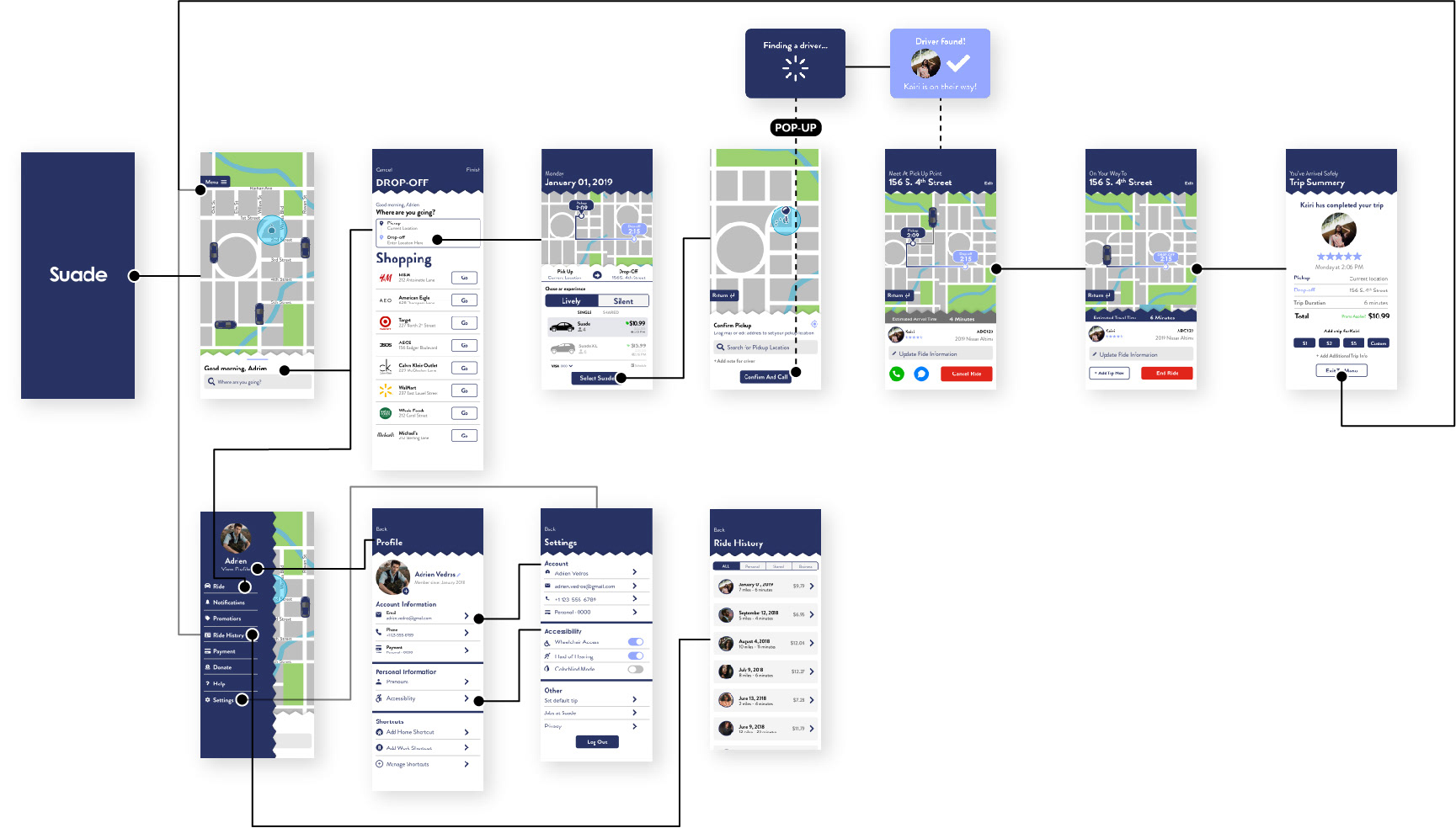
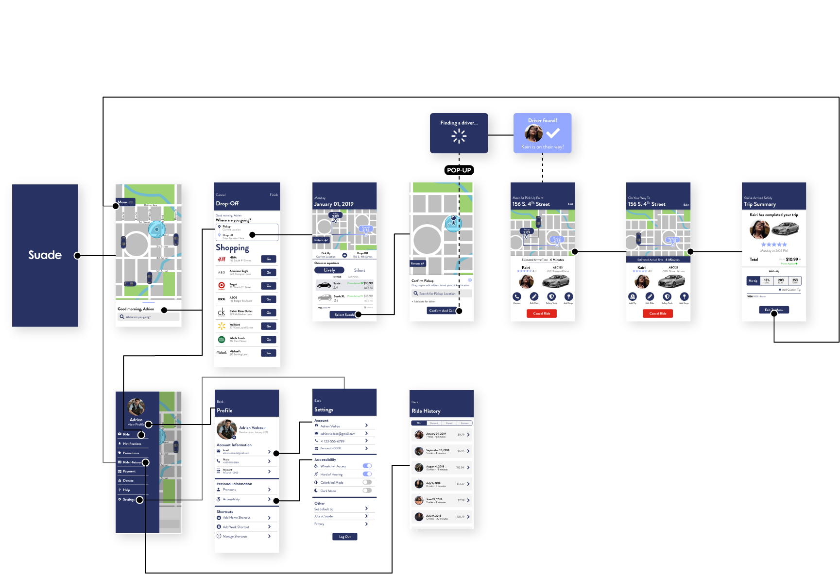
THE PROJECT
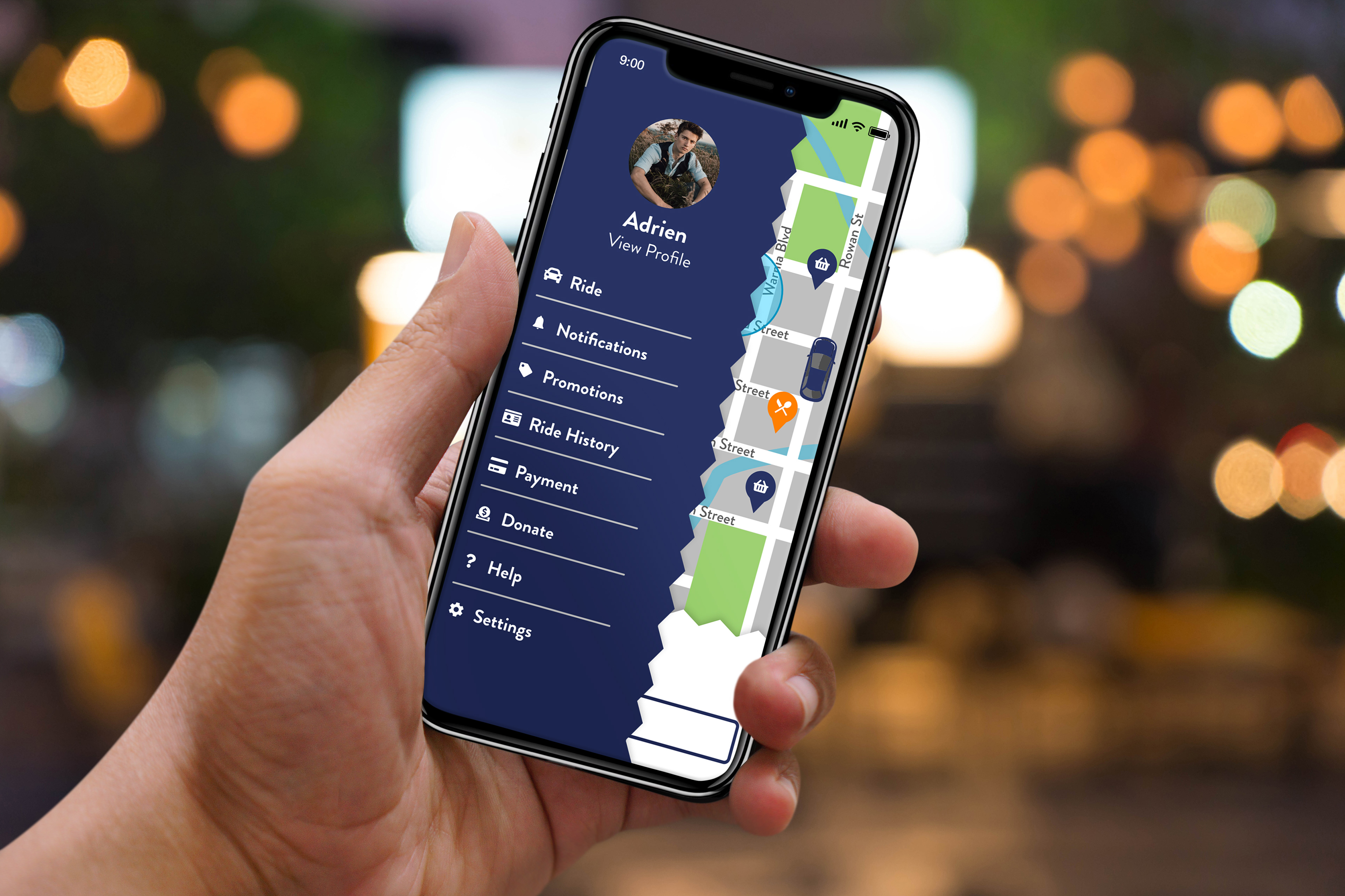
SUADE is a free ride sharing app that focuses on bringing the optimal type experience for users that are more introverted or suffer from social anxieties by giving them the option of selecting what kind of ride sharing experience they'd like to have.
THE GOAL
To create an app with a clean and intuitive app that has an easy pickup-and-go type of interface so users can get to where they need to go quickly and in their ideal way. The app should also fall into at least the standards for a AA–AAA ranking on the Web Content Accessibility Guidelines (WCAG). The app will pull from the standards created by other ride sharing apps to not alienate new users and add to the usability while
developing it's own unique features to differentiate it from contemporaries.
developing it's own unique features to differentiate it from contemporaries.
THE DEVELOPMENT
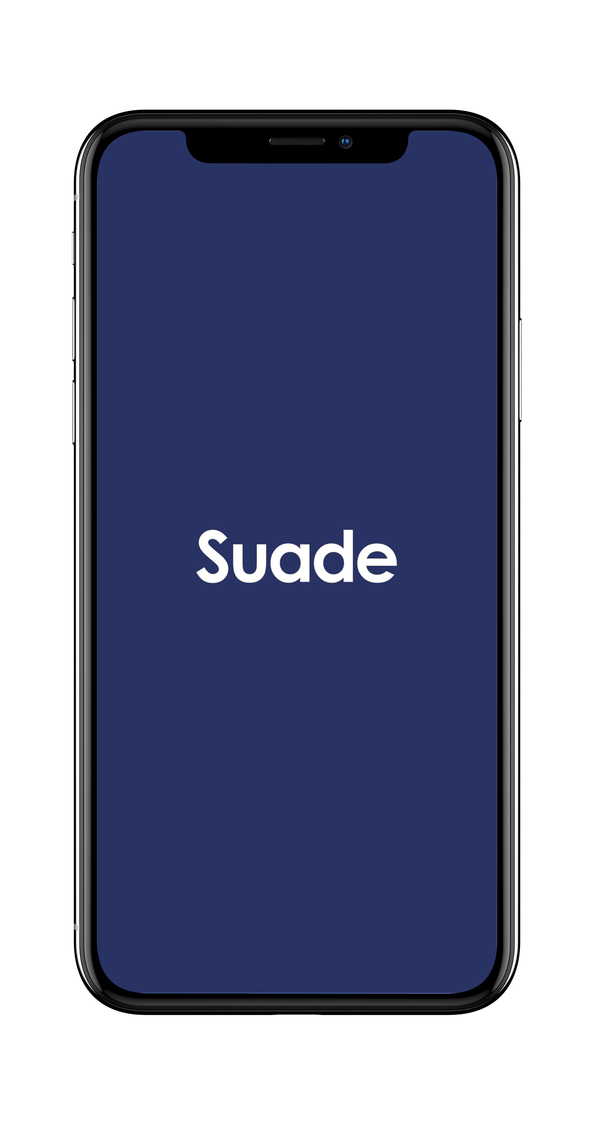
The development of SUADE began with my personal issues with social anxiety and introversion while dealing with overly friendly or extroverted drivers of other ride sharing apps. The app's name, SUADE, is actually an acronym for Shut Up And Drive Exceptionally, which is usually my thought process during rides that trigger my social anxiety. The color scheme of the app focuses on a dark blue to appeal to and be symbolic of introversion while also being a homage to Elvis's "Blue Suede Shoes" as SUADE and 'suede' are homonyms.
THE EXECUTION
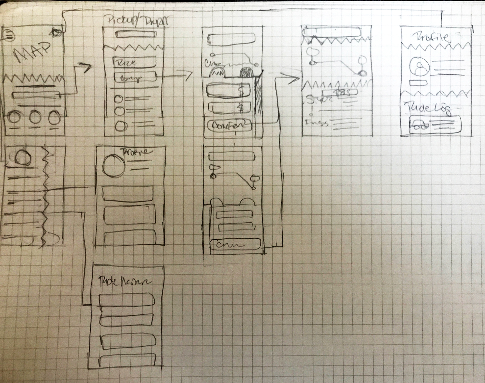
Version 1
Version 2
Version CHANGES
Following peer review and critique, I updated the design of SUADE to further reflect Apple's Human Interface Guidelines and the Material Design standards to secure a AA minimum rating. To comply, the color scheme was simplified to be more monochromatic, contrasts of assets were modified, buttons were resized and changed. Certain icons or features were edited or removed completely to reduce distraction and confusion from the primary focus.
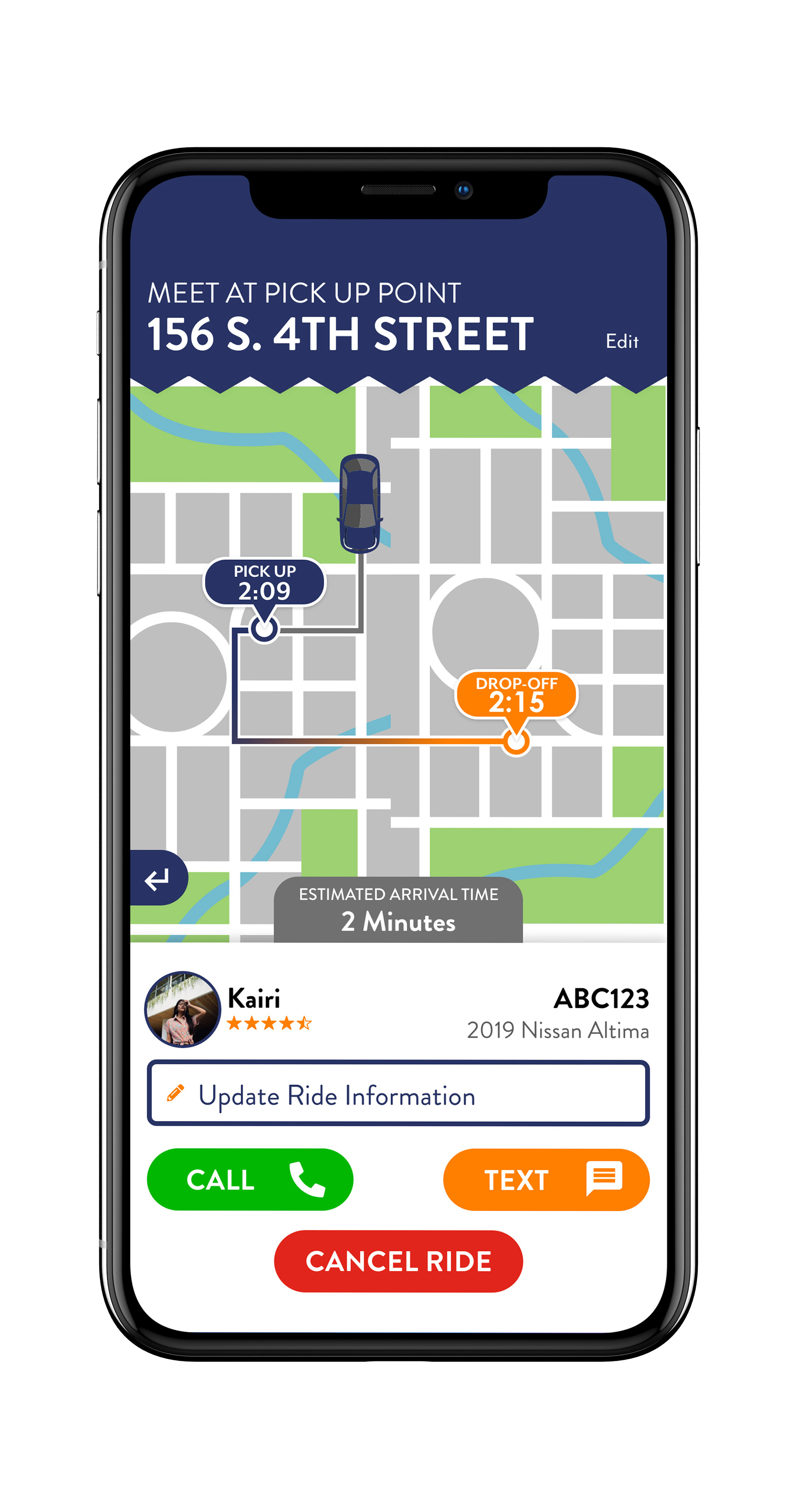
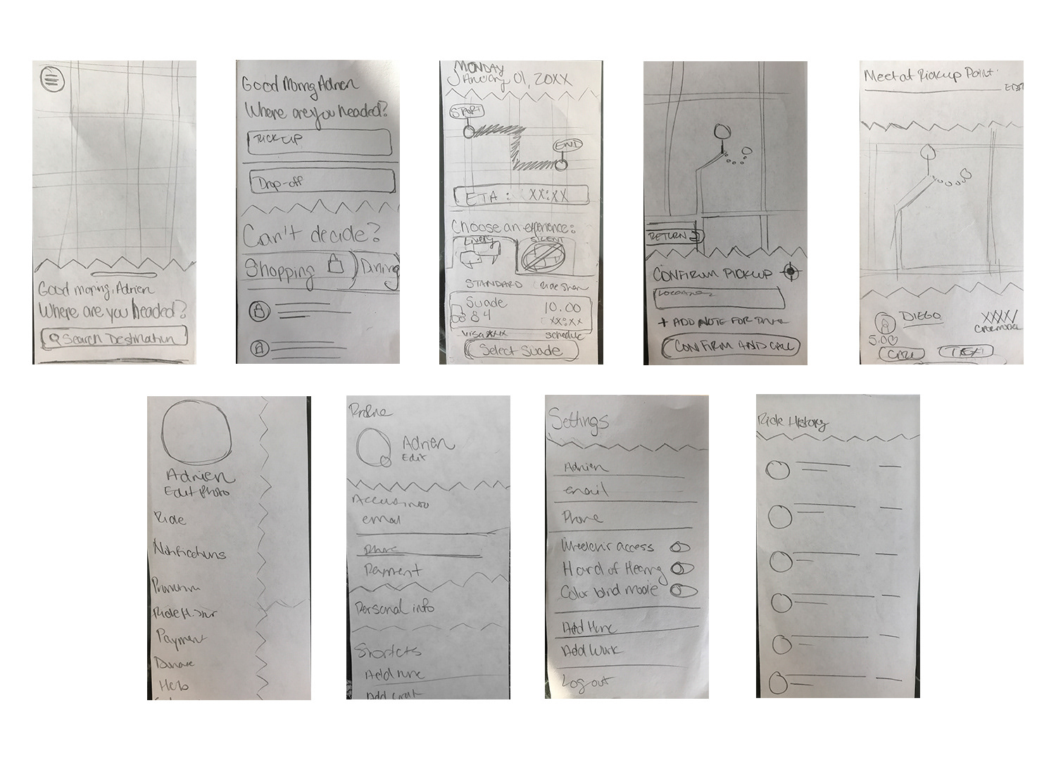
Version 1
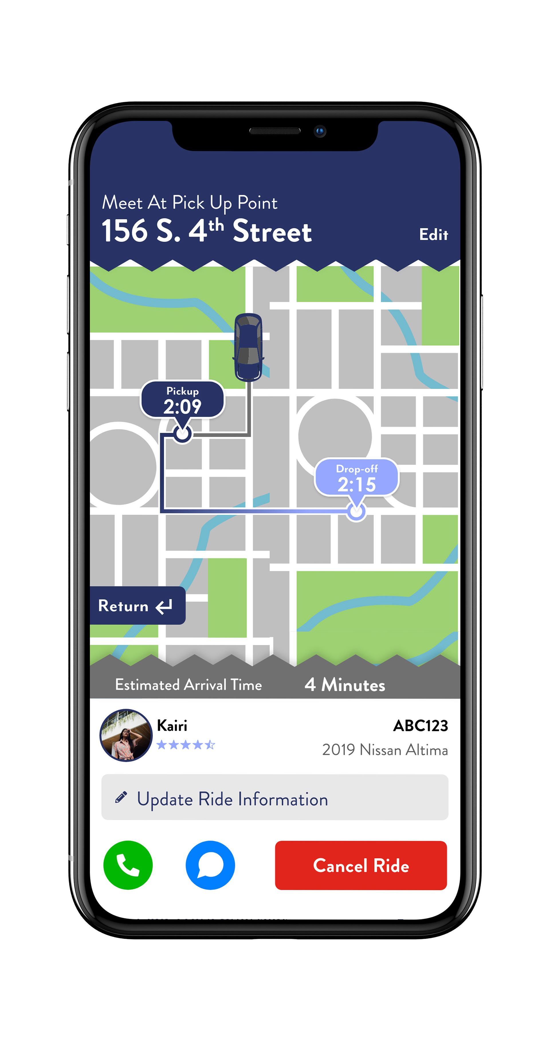
Version 2
Version 1

Version 2
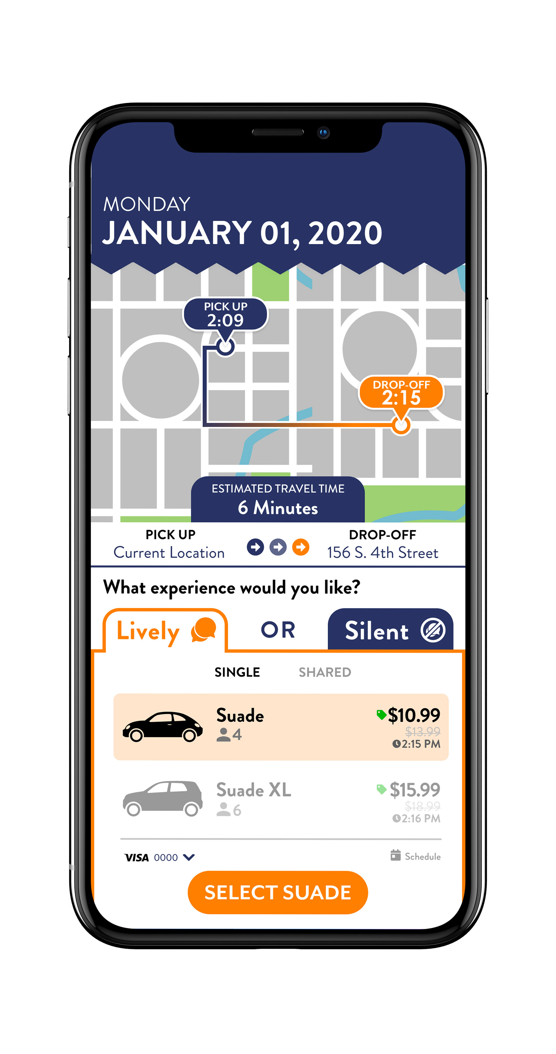
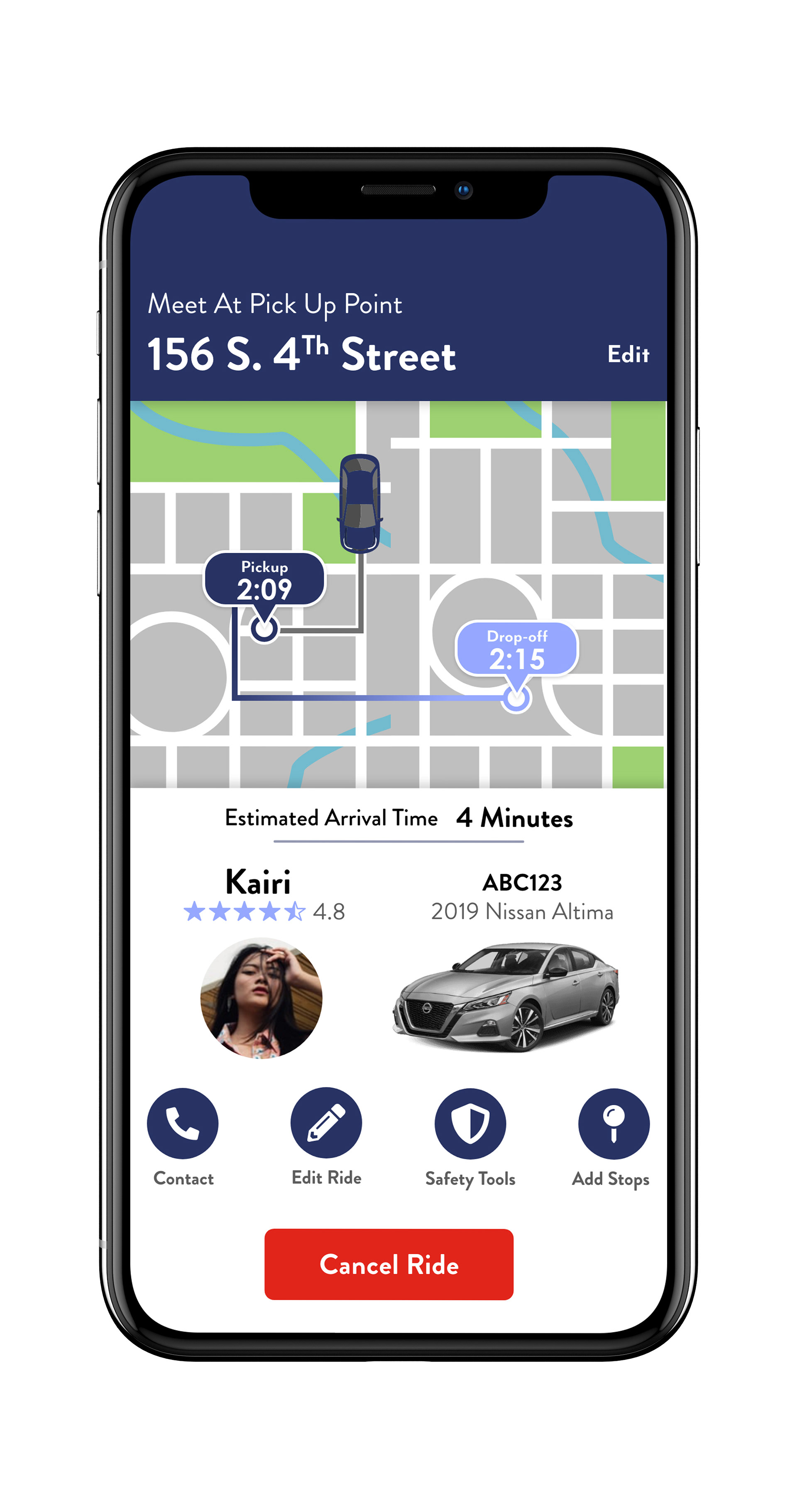
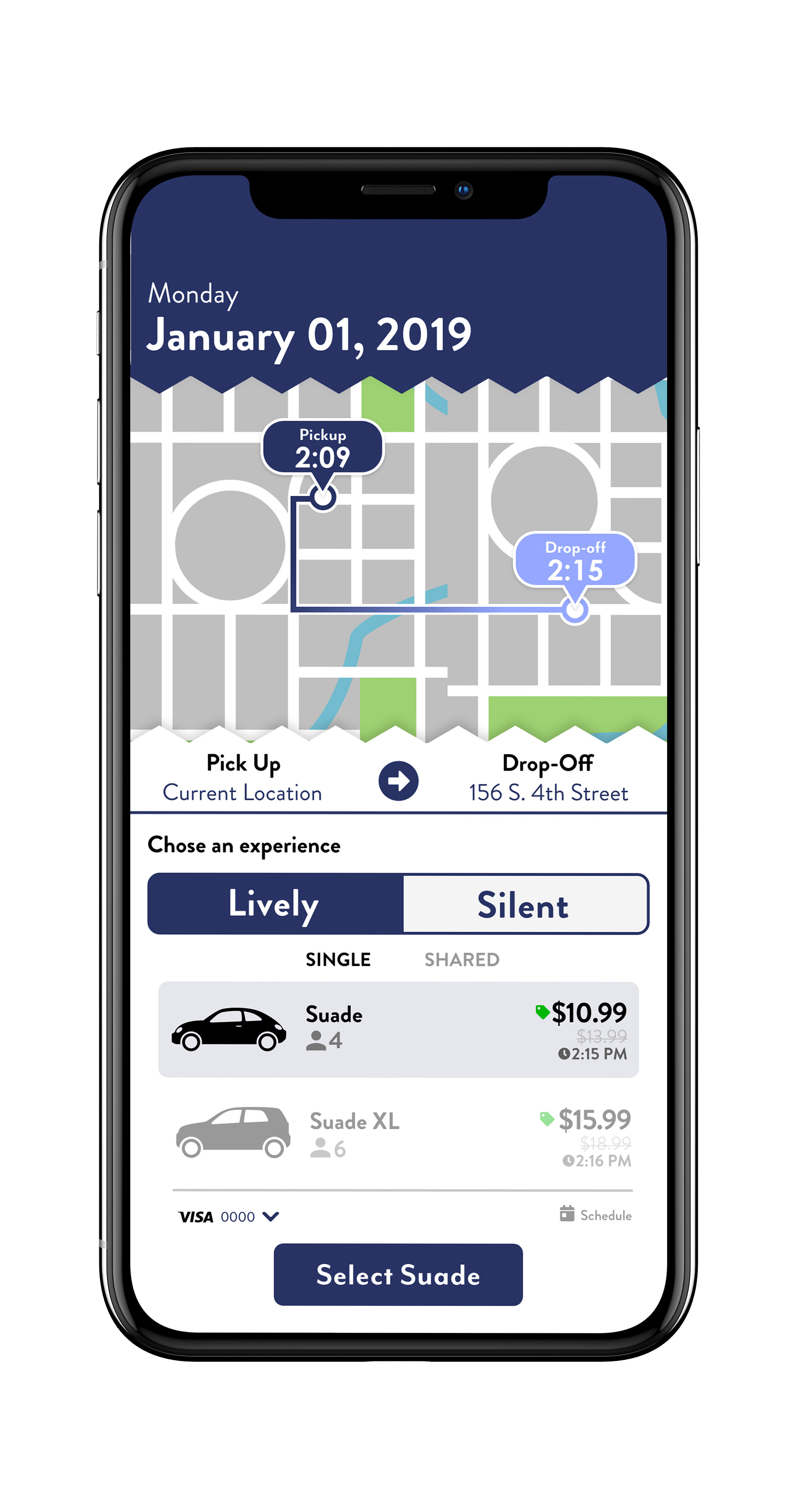
Simplification of the Ride Selection screen by removing redundant graphics and information. Also changing the verbiage used on the page to be compliant with Apple HIG.
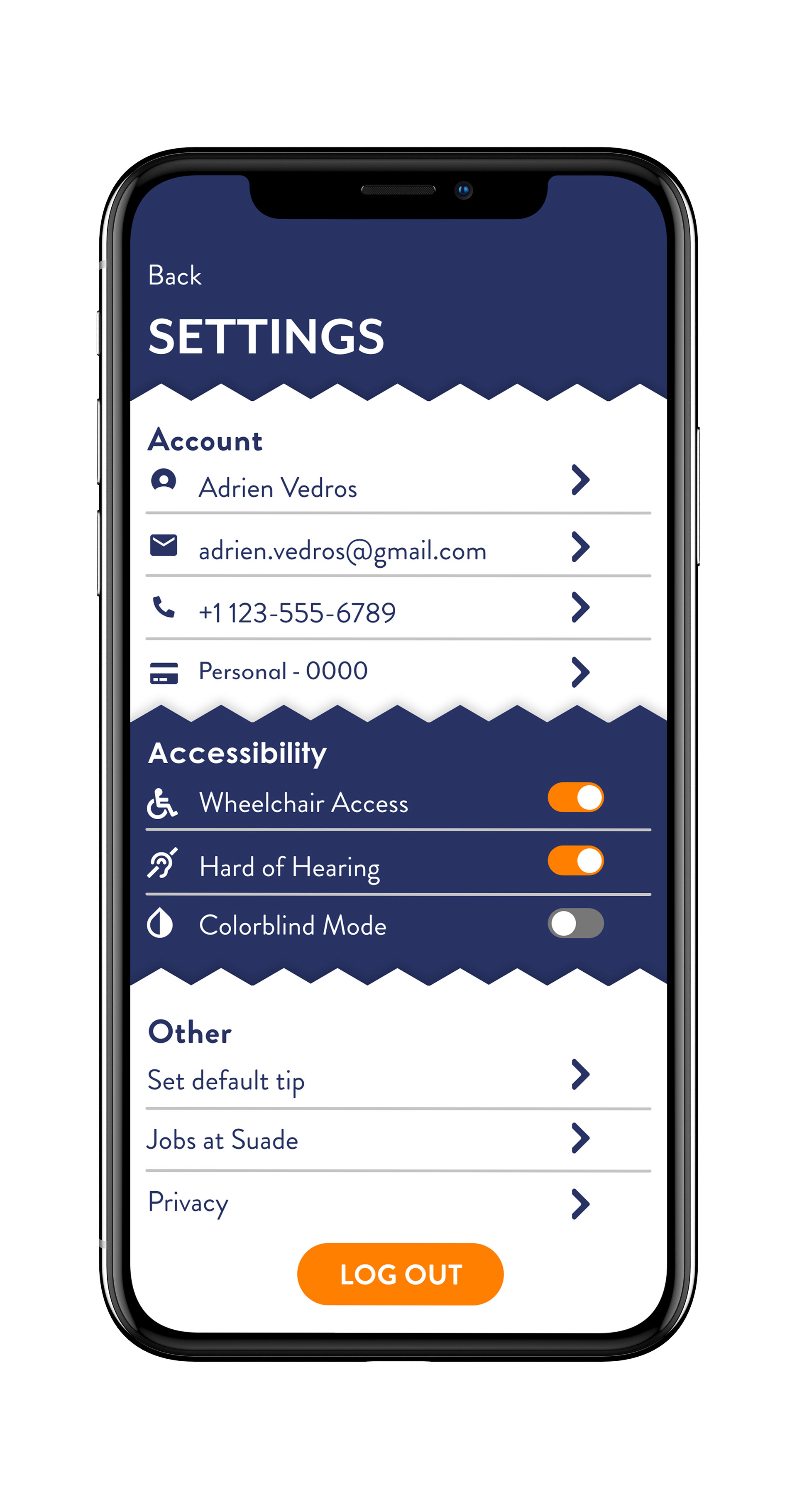
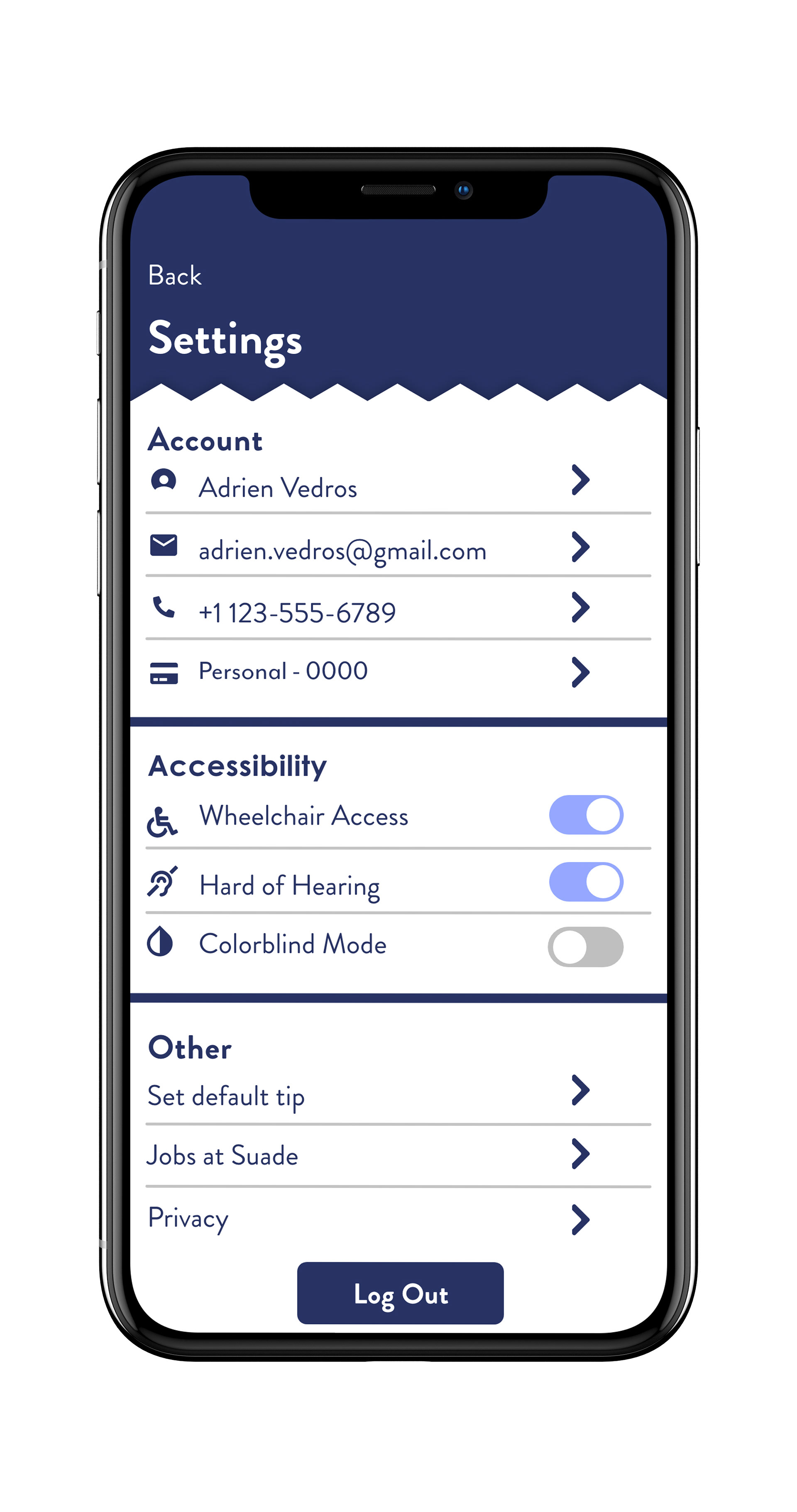
Settings and Profile screen were simplified to reduce confusion and create uniformity with a consistent hierarchy.
Version 1
Version 2
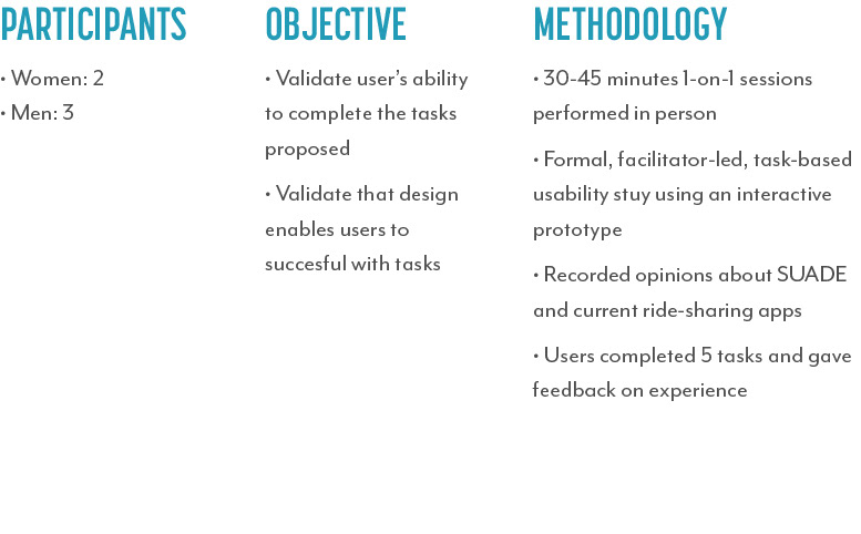
User testinG
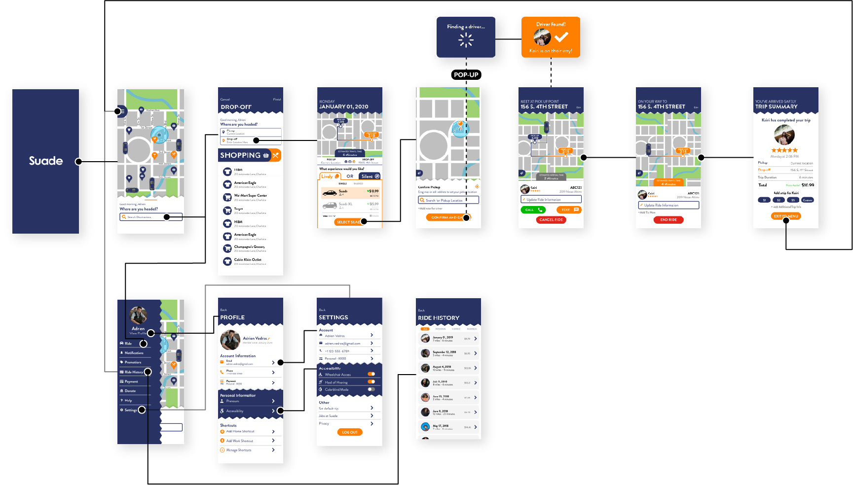
Version 3
Following User Usability Testing feedback, I updated the design further to add further emphasis on achieving compliance with Apple's HIG and Material Design standards as well as the opinions brought in from the users.
Version CHANGES
Factoring in the opinions of users, text and buttons were made larger to be easier to read for older users and labels were added for buttons to reduce confusion on their functions as the number of available buttons was increased. The hierarchy of information was revised to simplify the stream of information and options for the user. Buttons on the Drop-Off screen were made to have the same design shared with all buttons in the app. Throughout the app, the pattern on the header boxes were removed to add further simplicity as they were said to look jarring and in your face.

Version 2
Version 3
Version 2
Version 3
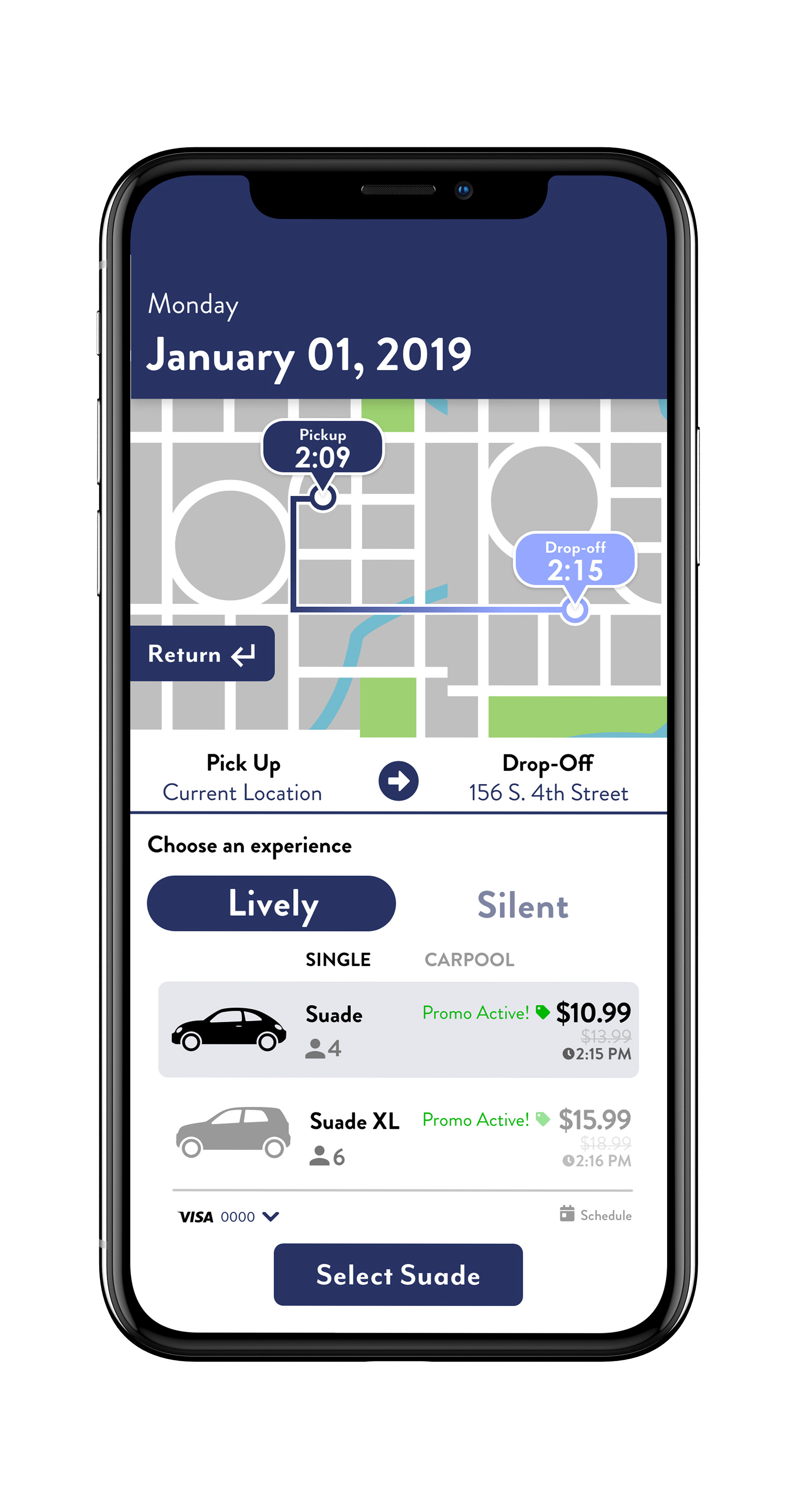
Simplification of the Ride Selection screen as users tested the selection option of Lively or Silent wasn't made clear with the previous layout. Also made it more obvious to users that Promos were being calculated into their prices.
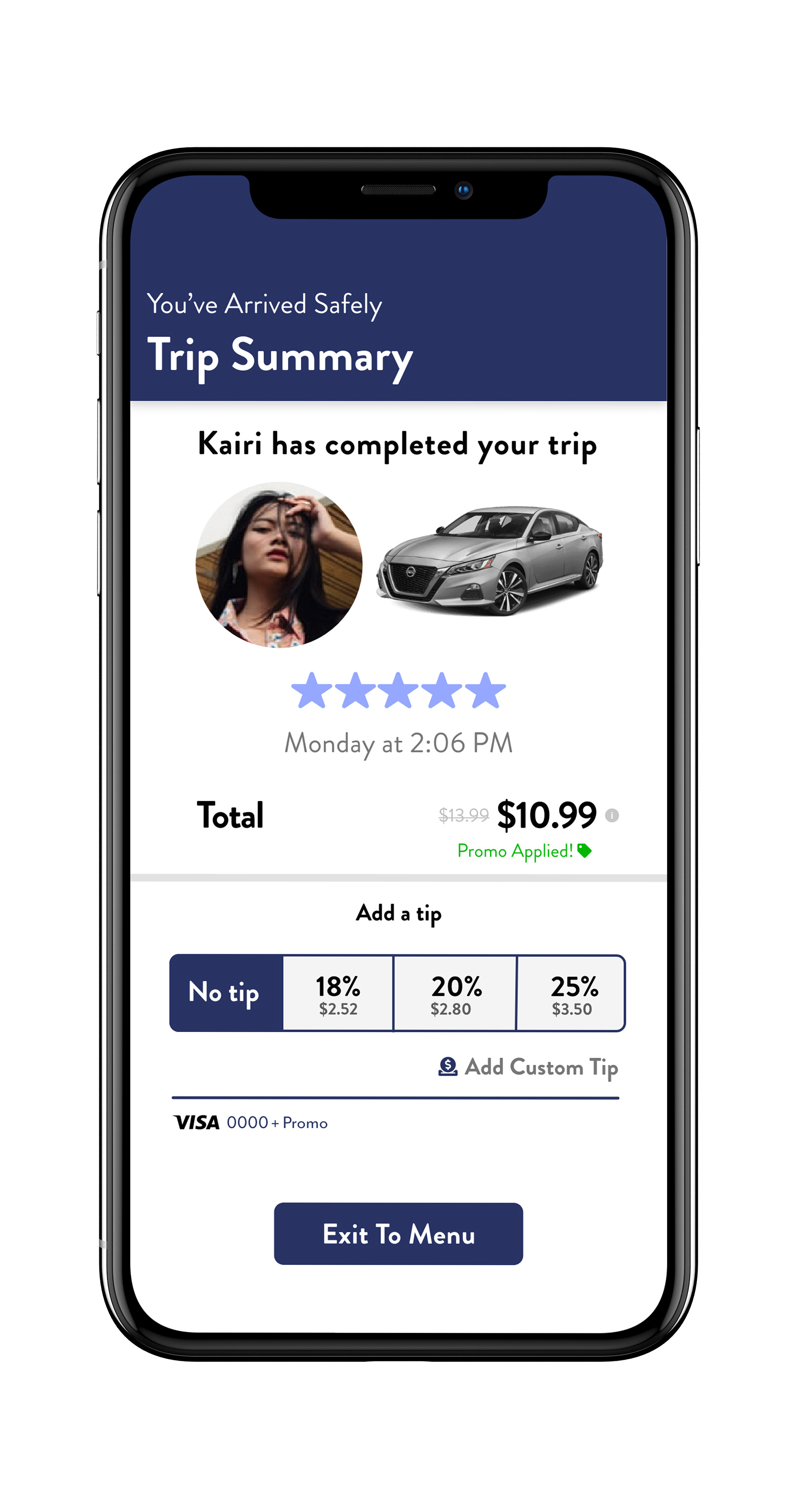
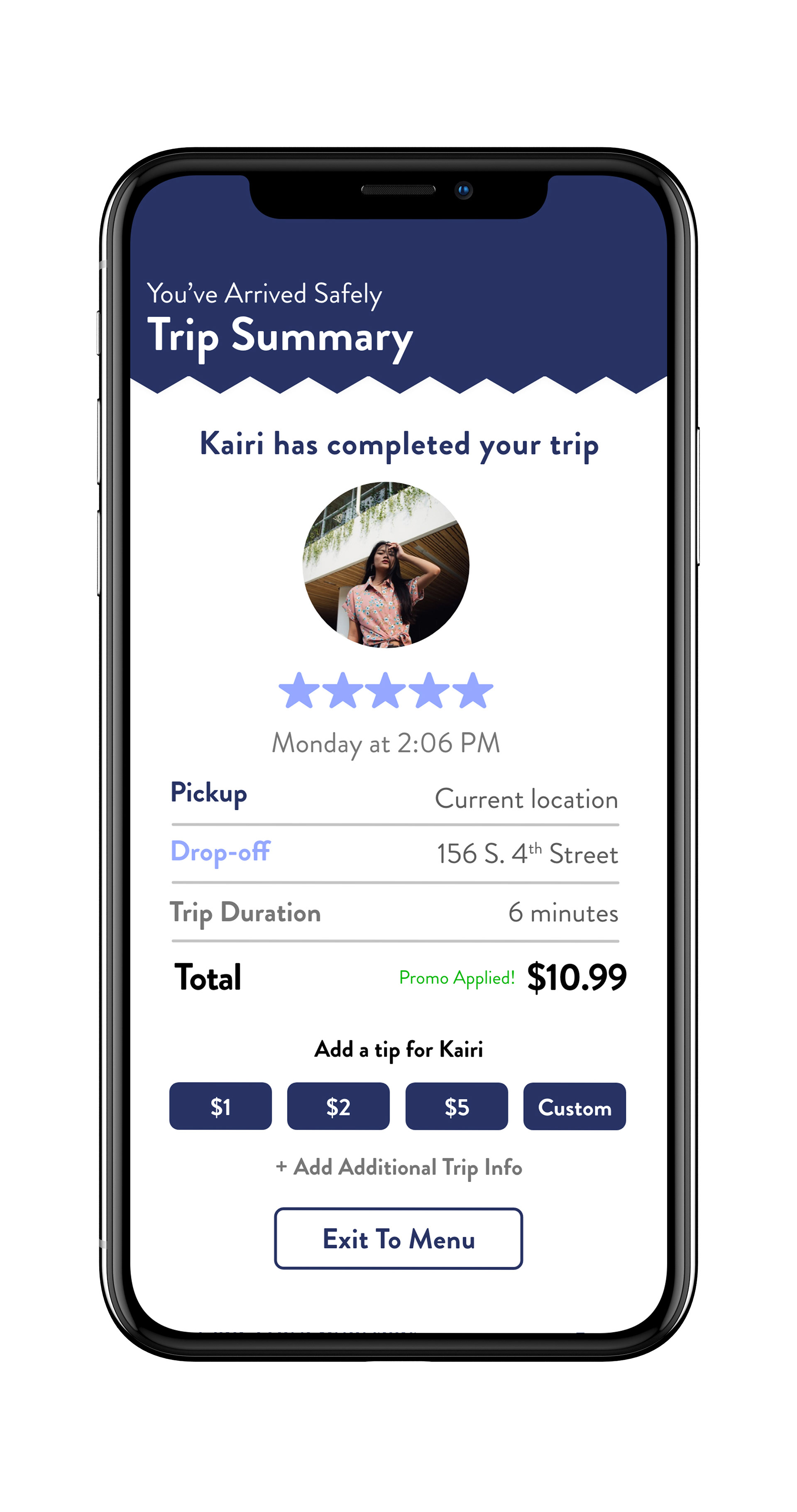
Hierarchy was modified on Trip Summary screen and information was reduced as users felt that the information on the ride Pickup and Drop-off was redundant and unnecessary. Tip selection was modified to include a percentage based system, while still showing dollar amounts, and made more aesthetically pleasing.
Version 2